 |
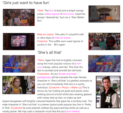
| Part of Molly's research from 2015, looking at several films in this post. |
USE THE titles TAG FOR MORE POSTS!
Highlighted every year without fail by examiners as a weakness across the national entry, film titles need to be closely scrutinised before you make decisions on how to design yours, thinking about ...
THE RAW NUMBERS:
- how many titles do you expect to see?
- provide counter-examples with very few or no opening titles
- what total running time is typical?
- again, note exceptions
THE SPECIFIC WORDING + ORDER:
Look carefully at the precise wording for each of these:
- companies (presents, a ... film/production, in association with...)
- director (auteur theory reflected in TWO credits - a ... film, directed by; where do these come in the order?)
- actors (introducing, starring, featuring, co-starring ...)
- technical roles (you need to be clear on which you will include; look for specifics eg director of photography or cinematography by?)
THE DESIGN
Look at use of these aspects and how they are used to distinguish/denote relative importance:
- (sans-)serif (consider to what degree titles connote genre here)
- size (names usually bigger than role, by etc; bigger stars bigger title?)
- colour
- case (UPPER, lower, Sentence case, maybe mixed)
FX, ANIMATION
Some titles are simply static, but often there's some form of movement...
- animation/movement/FX?
- transitions or straight cuts? fade to/-in from black?
- intertitles? (over black screen)
- what to include (and exclude),
- the timing (continuous with identical gaps? from the start or later in the opening? when do they end?),
- the order titles appear in,
- font (serif or sans-serif? upper/lower case, a mix?),
- size and any variation of this (within titles and for different roles),
- the specific wording,
- the (auteur) convention around crediting the director twice, the wording and order of this,
- checking if distributor and production companies receive different wording,
- looking for variation in the presentation of stars, co-stars, new actors (introducing...),
- the specific roles that are credited (as opposed to dumped into the end titles),
- colour,
- animation,
- transitions (fade in/out? wipe?),
- other design features (e.g. underline, graphic containers)
- the main (film) title (is it differentiated?)
... there is a huge amount to think about (and later to explain and justify your choices)!!!
IN THIS POST: Links and video clips to help you with researching and getting ideas for film titles design. I'll blog separately on researching fonts and looking for a specific downloadable font. First, a vodcast - you'll need to create similar video guides...
 |
| The 2015 Candelabra group were very clear on their influences and intertextual references [post] |
There are lots of ways you can explore and research this topic...
Look up the index of books on film - titles will often feature.
Look for features in journals such as Sight and Sound or the Media Magazine; both have featured this topic before.
Look for books on specific titles artists, Saul Bass being perhaps the most famous practitioner of this art. There have also been many articles written on the titles sequences of franchises, notably Bond. Saul Bass links: ArtoftheTitle; Guardian feature; annyas.com gallery/analysis/quotes; Wiki; just one YouTube example - you can find many more...
Over an hour of Saul Bass titles spanning decades!
Screenshot and discuss a range of specific examples (as you will be!). We may do a vodcast task such as this.
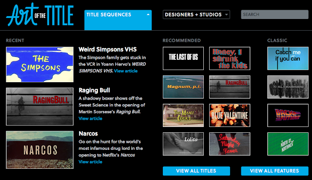
Using dedicated websites such as ArtOfTheTitle.com to explore wider examples you might not otherwise encounter..
 |
| The site has a huge archive of handily presented (they've done the screenshots for you!) examples and features |
Look at past student blogs to see how they approached researching and experimenting with titles. Tilly Dennis' resubmitted 2014 AS production included some excellent experiments with this, trying out multiple fonts and animations for audience feedback before settling on one style. Candelabra, from 2015, also featured some astute experimentation with a range of styles; here's the 'titles' tag link from one of this group's blogs.
Tilly's titles experiment:
Try looking at (and clicking through to some results) a basic online search; the image gallery itself could provide some unexpected ideas and inspiration...
 |
| You could well find inspiration from even a simple search such as this! |
 |
| Some Saul Bass classics unsurprisingly feature prominently in the results... |
No comments:
Post a Comment